Nancy Hou and Josh de Sousa of Hou de Sousa, Winners of the 2019 Flatiron Public Plaza Holiday Design Competition
Nov 8, 2019
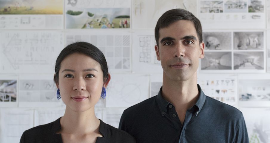
Meet Nancy Hou and Josh de Sousa, cofounders of the award-winning architectural, art, and design studio Hou de Sousa. The pair is also this year’s winner of the Flatiron Public Plaza Holiday Design Competition held by the Flatiron/23rd Street Partnership and Van Alen Institute.
Hou de Sousa’s art installation, Ziggy, features 20,000 feet of iridescent cord that visually converge and dynamically filter the surrounding context with shifting patterns, color, and light. Ziggy will be on display on the Flatiron North Public Plaza as part of the Partnership’s “23 Days of Flatiron Cheer” holiday programming from November 18th through January 1st. Check out Ziggy sneak peek photos!
1. Congratulations on being selected as this year’s winner of the Flatiron Public Plaza Holiday Design Competition for your art installation, Ziggy. What was your reaction upon hearing the news?
Nancy Hou: The opportunity to participate in this annual competition is an incredible honor. We had followed the results over the years, and really admire the quality and cleverness of the past pavilions. So, when the news arrived that we had actually won, we were ecstatic!
2. Tell us about Ziggy. What was your inspiration for the installation and its name?
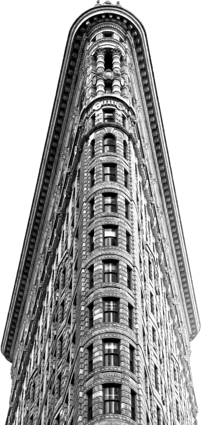
Josh de Sousa: We began by thinking about the footprint and form of the Flatiron Building and how its shape is a direct consequence of urban planning, and the consistency of the Manhattan grid thrown off kilter by Broadway’s diagonal route.
NH: Ziggy will be located on Flatiron North Plaza, but rather than attempt to occupy the entirety of the space, we thought of the site as a sort of pool table that limits the trajectory of the design. I don’t remember who it was, but one of us doodled a sketch of a ricocheting pool ball, and the rest of the design flowed from there.
JD: In terms of the name, we figured Ziggy was apropos given the zigzagging course of the project, plus, who doesn’t love David Bowie?
3. What do you hope the public’s takeaway will be when experiencing the artwork?
NH: Nothing all that fancy or profound, just that it provides some joy and seating for those in need of a break.
JD: Now that we’re pretty far along with the fabrication of the project, we’ve tested out the lighting and it’s clear that Ziggy must be experienced in person. While the project is 100% analog, its iridescent glow suggests that you’re observing and walking around a collage of the digital and the real or some form of augmented reality.
4. Your firm Hou de Sousa “promotes innovative, culturally progressive and environmentally responsible solutions.” Please elaborate on this and briefly describe your roles at Hou de Sousa.
NH: Design is a process that takes time and involves lots of folks. We try to work with organizations that have a positive public impact, and we strive for solutions that are simultaneously novel, classic, and considerate of the environment.
JD: We don’t have fixed roles at the office and each person does a bit of everything. We’ve worked with each other since our school days, so our understanding of architecture is really intertwined. Nancy often finishes my sentences during design meetings and vice versa.
5. What inspired you to create Hou de Sousa? Can you share with us some of the ways you keep your architectural practice fresh and creative?
JD: We worked on a couple of projects together in school, and quickly realized that we were coming up with better projects together than individually. When the first commission opportunity arrived years later, it didn’t seem so crazy to go after it.
NH: For us, the start of each project is pretty informal. Architecture is the marathon of problem-solving. With each new project, there is a ton of information to parse through and a constellation of constraints to consider. Along the way, we tend to entertain every idea that pops up, even during the early stages. Sometimes these initial hunches have worked out really well or got us on the right track.
6. Nancy and Josh, you both studied architecture in undergraduate and graduate school. What sparked your interest in architecture?
NH: My interests growing up tended to always involved making something, whether it was art, origami, or cooking.
JD: I can remember the specific moment. I was playing with my cousins in Portugal when we were all around 11 or 12 years old. We were at this rocky shore and started rolling large stones around in order to build the outline of a small swimming pool. It was surprisingly satisfying to piece together this simple wall and watch the water fill in. Imagining physical possibilities, and then executing the outcome, was tremendously addictive.
7. Outside of New York City, which cities do you consider architecturally interesting or significant? Any favorites come to mind?
JD: It’s tough to narrow down the list, and it would be lovely to visit many more places. Paris really stands out due its consistency, whereas Tokyo and Barcelona are compelling for the exact opposite reason. Rio’s topography and Hong Kong’s density are astounding. If Rome only had Borromini, it would already be incredible. I also love the quality of the light and enormous scale of Los Angeles.
NH: The list of buildings is much longer, but some that always manage to come up in conversation include Peter Zumthor’s Therme Vals in rural Switzerland, the Seattle Public Library, and the High Line [in New York City].
8. Your offices are located in nearby Union Square. However, when you’re in the Flatiron District and it’s time to grab a bite, where do you like to eat? Do you have a go-to dish?
NH: On special occasions, our favorite is Cosme. We visit Periyali, Scampi, and Eataly’s Il Pesce more regularly, as we both grew up eating lots of seafood. I’m getting hungry just thinking about Periyali’s octopus and Il Pesce’s flounder.
JD: Oh, and Xi’an Famous Foods when we’re craving something spicy.
9. What do each of you consider a “must-see” or “must-do” gem in the Flatiron community?
NH: Of course the Flatiron Building. Its svelte tapered form factor cloaked with a rich texture of ornament is timelessly chic.
JD: Allied Works’ renovation of Eleven Madison Park is incredibly elegant as well. Love the way the molding details fold across between the walls and ceiling.
10. Finally, choose three words to describe the Flatiron District.
Abundant. Cheerful. Elegant.


